


English version of the interview here.
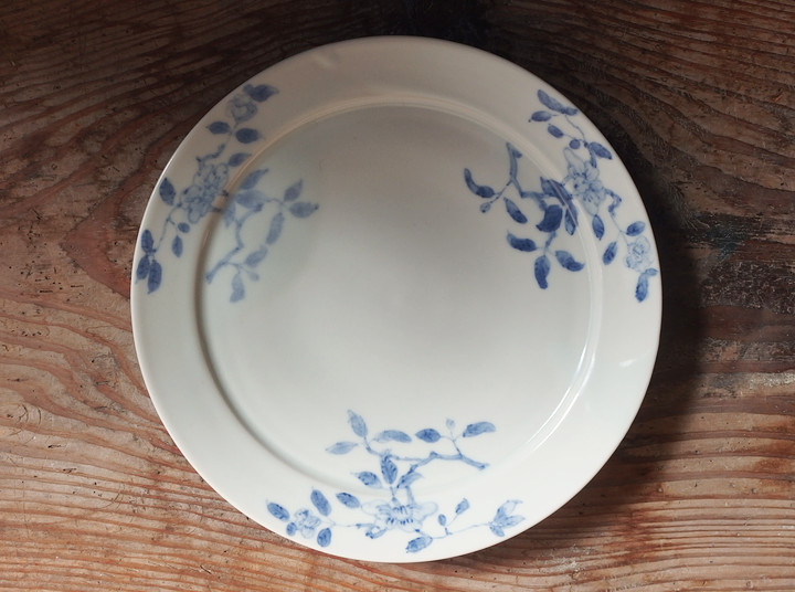
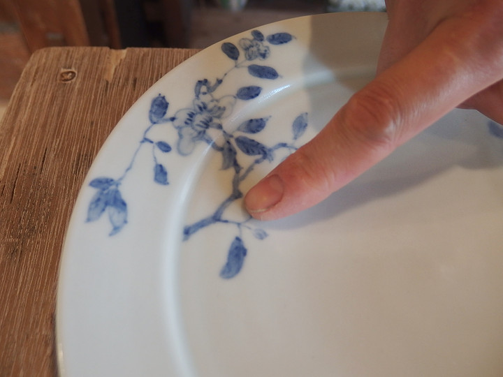
Floral Motif Rim Plate(21cm)
Hanada: I’d like to ask you about your new works.
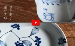
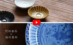
First, the Floral Motif Rim Plate in the 21cm size.
Maya Inamura: I looked at some antique pieces you lent me and thought they would be nice if made larger, so I chose 21cm size.
I’ve always found it interesting how some plates made for export to the Netherlands long ago had patterns that crossed over the rim, so this time I painted the flowers in that way.
Hanada: We showed you some old sometsuke pieces.
Maya Inamura: The designs were very clear and quite bold, but I wanted to reinterpret the interesting compositions in my own way. When I tried painting more lightly, it ended up with a look that could also work well in a Western-style setting.
Hanada: Rearranging the original motif into a three-point composition is very much like you. I feel that if each element were made too small, it would lose its appeal.
Maya Inamura: I agree. I felt it was better not to leave too much empty space. Also, I was really struck by this sense of movement and curvature. In Japanese designs, branches often grow upward from the base, but here the branches appear partway along. I thought, “Starting from the side—that’s interesting!”
Hanada: I see.
Maya Inamura: It’s a very unique way of framing the design, quite different from old Imari, for example.
Hanada: The brushwork feels different from your usual style. Did you consciously change your approach in the outlining and shading?
Maya Inamura: I usually value speed and momentum, but for this piece I wanted to draw more carefully and neatly.
Hanada: It comes through clearly. So, how would you use this plate?
Maya Inamura: For a morning omelet. Pasta would work well too.
Something I’ve Always Loved
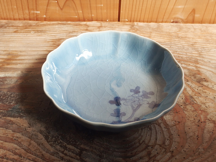
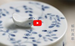
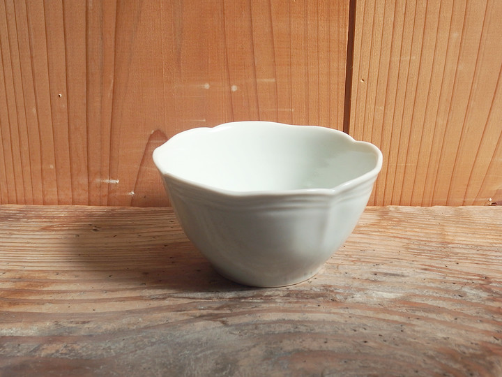
Hanada: Next is the namasu bowl. It’s a traditional form, but this is your first time making it. What made you decide to create it now?
Maya Inamura: I’ve always loved the shape of namasu bowls. I had been using namasu bowls made by my teacher, Mitsuo Fujitsuka, for a long time, but I felt that I wasn’t quite ready to make them myself. This time, I thought I might finally be able to.
Hanada: Was there anything you paid particular attention to when making them?
Maya Inamura: To bring out the soft, gentle feel of the scalloped rim, I kept the mold carving to a minimum. Also, if I used my usual glaze, it would feel a bit heavy, so I changed the glaze formula. The crackle also helps prevent the design from looking flat. It’s a very intuitive process, though.
Hanada: What is the appeal of the namasu bowl for you?
Maya Inamura: A sense of reassurance. It’s a form that has existed for a long time and that everyone knows, so it feels easy to use without much thought.
Hanada: You just know it will be easy to use, without overthinking it (laughs).
Maya Inamura: Like a reliable brand. When you think of a namasu bowl, this is the shape that comes to mind.
Iron Painting and Sometsuke
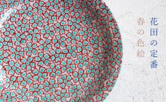
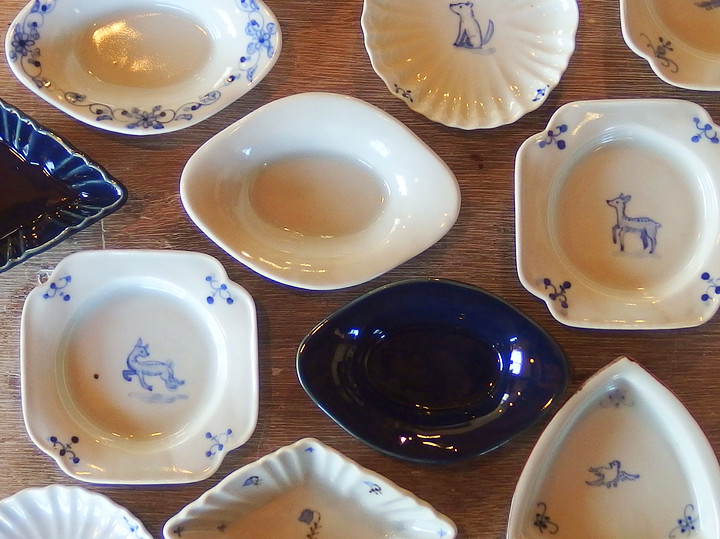
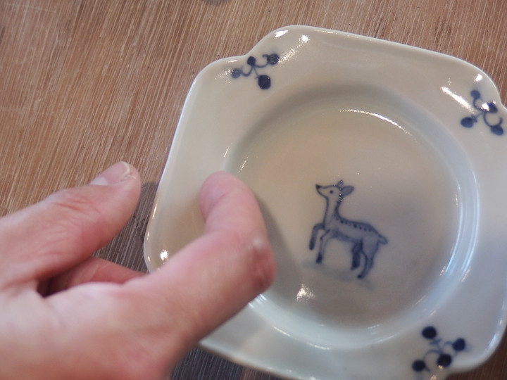
Hanada: Now, this diamond-shaped small plate.
Maya Inamura: This is my first time combining iron painting with sometsuke.
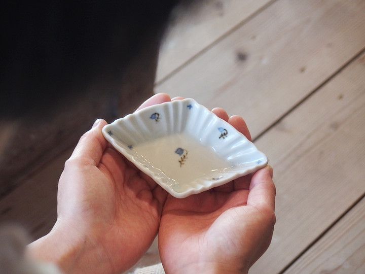
Hanada: When paired with iron painting, the gosu blue looks brighter.
Maya Inamura: Iron painting is fascinating—when it’s present, the white areas can even look slightly creamy. Even with the same glaze, it appears different.
Hanada: And adding iron painting to sometsuke gives it a more colorful impression.
Maya Inamura: I’ve recently rediscovered how interesting iron painting can be, so I’d like to explore more variations.
Hanada: The brush movement also changes with iron painting.
Maya Inamura: It’s a bit harder to paint, but unless you draw boldly, the color doesn’t come through. So I paint thicker and darker. Gosu shows exactly as you paint it, but iron comes out more softly.
Hanada: What would you use this for?
Maya Inamura: Simmered beans, pickles, or even as a soy sauce dish.
Hanada: This kind of shape is actually very suitable for soy sauce.
Maya Inamura: I think something slightly elongated works better than a perfect circle. For sashimi, for example.
Different Kinds of Elegance
Hanada: Next, the flared cup. You took inspiration from French antiques.
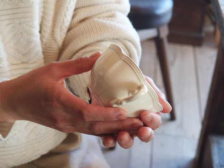
Maya Inamura: This was actually hand-carved, not made with a mold.
Hanada: Those originals are slip-cast, right?
Maya Inamura: I think so.
Maya Inamura: I really like the softness of this piece. It feels like a different kind of elegance from Japanese tableware. Also, decorating the rim isn’t very common in Japanese pieces, which makes it interesting.
Hanada: You removed the original handle and turned it into a small bowl. It’s only in white porcelain, right? It seems like other colors could work too… maybe lapis blue?
Maya Inamura: This one just feels right in white.
Hanada: True—lapis blue might make it feel too Japanese.
Maya Inamura: And I didn’t feel it would suit it very well.
Hanada: My apologies (laughs). So how would you use it?
Maya Inamura: For yogurt, or as a café au lait bowl.
Hanada: I see—café au lait in this would look stylish. Well, it was originally a teacup, so it makes sense.
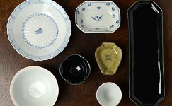
Small Plates and Small Dishes
Hanada: And now, the smaller pieces.
Maya Inamura: Once I tried making them, I found them surprisingly interesting. Taking a larger form and making it smaller does make it quite charming.
Hanada: Small plates usually don’t require as many steps as larger ones, but I thought it would be interesting to put more work into them.
Maya Inamura: It was a fun process. I wasn’t just scaling them down—I wanted to make sure the original character still came through. For example, the rim balance here follows that of the 21cm plate.
Hanada: It looks like it would fit a single macaron perfectly.
Maya Inamura: Or a canelé. Or some chocolates.
Hanada: You keep mentioning sweets.
Maya Inamura: I give my daughter a small treat in the morning, and this might be just right for that.
Hanada: I’m sure she’d love that (laughs).
“So Far” and “From Here On”
Hanada: You always prepare fresh and engaging new works. You can really feel how much you enjoy the process through the pieces.
Maya Inamura: This time was a lot of fun too!
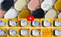
Hanada: Then we look forward to the two-person exhibition with Haruya Abe in June.
Maya Inamura: Yes. There will be both standard pieces and new works, so I hope people can sense both “what has been” and “what’s to come.”
Hanada: Thank you very much.
≪ END ≫
花文リム七寸皿について
-: 新作について、色々お話しを伺いたいと思います。
まず、花文リム7寸皿について。
稲村: お借りした骨董を見て、大きくしたらいいなと思って7寸にしました。
昔のオランダへの輸出用のお皿などで文様がリムをまたいでいるものを面白いなと思っていたので、今回はそのように花を描きました。
-: 古染付を見ていただきました。
稲村: 絵がハッキリしていて、主張が強い感じでしたが、構図の面白さを自分なりに落とし込むことを目指しました。
薄く描いてみたら、割と洋風にもいけそうな感じに仕上がりました。
-: 元の文様を3点の構図にアレンジしてしまうのは流石稲村さんですね。
僕は、これ一つ一つを小さくしすぎると、面白くなくなってしまう気がします。
稲村: そうですね。
余白を取りすぎないほうがいいなとは思いました。
あと、この曲がっている感じが凄いなと思います。
日本だと、下から幹や枝が伸びている絵が多い気がしますが、途中から枝が出現していますよね。
「最初が横からなんて、面白い!」と思いました。
-: なるほど。
稲村: 古伊万里なんかと違って、切り出し方がユニークですよ。
-: この絵付けは、普段と筆致が違いますね。
骨描きやダミの部分で敢えていつもと違うように心がけたのですか。
稲村: 普段は勢いや走りを重視していますが、これは細かくキレイに描こうと思いました。
-: 意図通りですね。
さて、稲村さんなら、このうつわを何に使いますか。
稲村: 朝のオムレツです。あとはパスタとか
昔からずっと好きだったもの
-: 続いてなます皿です。
昔からあるものですが、今回初めてです。
なぜ今回作ろうと思ったのですか。
稲村: なます皿のかたちは昔から凄く好きでした。
師匠(藤塚光男さん)の作ったなます皿をずっと使わせてもらっていたのですが「自分ではまだ作り上げることはできないな」という感じがありました。
でも、今ならできるかもしれないと思って・・・。
-: 作る際、気を使ったことはありますか。
稲村: 輪花の柔らかいフワッとした感じを出すために、型はあまり彫らないようにしました。
あと、いつものままだとモッタリした感じになるので、釉薬の調合も変えました。
貫入も入っているので、絵の感じがのっぺりしないんです。
まあ、感覚的なものですが。
-: 稲村さんにとって「なます皿」の魅力とは何ですか。
稲村: 安心感です。
昔からあって、皆が知っているから、色々確認しなくても使いやすい気がする。
-: 難しいこと考えなくても、どうせ使いやすいだろうと(笑)。
稲村: 安定しているブランド・・・みたいな。
なます皿といえばこのかたちですし。
鉄絵と染付
-: さて、この菱型小皿。
稲村: 鉄絵と染付を合わせたのは初めてです。
-: 鉄と合わせるとゴスが明るく見えますね。
稲村: 鉄絵って、すごく不思議で、鉄絵があると白い部分がクリーム色っぽくも見える気がします。
同じ釉薬でも、違って見える。
-: あと、染付に鉄絵が入ると、カラフルな印象になりますよね。
稲村: 最近、鉄絵の面白さにあらためて気付いたので、もうちょっとバリエーションを増やしていきたいです。
-: 鉄絵は、筆の動きも変わります。
稲村: ちょっと描きにくいんですけど、鉄絵は豪快に描かないと色に出てこないので、濃い目に、太く描いています。
ゴスは描いたまま出てくるんですが、鉄はもっとふんわり出てくる感じです。
-: これは何に使いますか?
稲村: お豆炊いたのとか、漬物とか、或いは醤油皿として。
-: こういうかたちは、実は醤油皿に適していますよね。
稲村: 正円よりちょっと長いほうがつけやすいと思うんです。
刺身とか・・・。
上品さの種類
-: 続いて、フレアカップ。
フランスのアンティークを参考にしていただきました。
稲村: これは、実は型ではなく、手彫りです。
-: あっちでは鋳込ですよね。
稲村: 多分そうだと思います。
稲村: これの柔らかい感じが好きです。
上品さの種類が和食器とは違うなと思いました。
あと、縁に装飾することって和食器にはあまりないので、その辺が面白いですね。
-: 稲村さんは、元々付いていた取っ手を取って小鉢にしてくれました。
これは白磁だけだったのですね。
ほかの色も作れそうなものですが・・・ルリとか。
稲村: これは、白な気がして・・・。
-: 確かにルリにすると和っぽくなっちゃいますかね。
稲村: あと、そんなに合わないような気がしたので。
-: 失礼しました(笑)。
さて、稲村さんは何に使いますか。
稲村: ヨーグルト、カフェオレボウルとして。
-: なるほど。これでカフェオレはオシャレですね。
まあ、元々ティーカップですから、自然といえば自然です。
小皿、豆皿
-: で、小さいうつわです。
稲村: やってみると、案外面白くて。
元々おおきかったうつわを小さくしてみると、確かに可愛い。
-: 小皿や豆皿って、大きいもの作るときほど工数を掛けないと思うんですけど、敢えて作り込んでみると面白いと思いました。
稲村: 楽しい制作でした。
小さくするだけでなく、元々の感じがちゃんと活きるように考えました。
例えば、このリムのバランスは7寸の感じのまま持ってきています。
-: マカロン一つ丁度置けそうです。
稲村: あとカヌレとか。あとはチョコレート・・・。
-: 出てくるのは、お菓子が多いですね。
稲村: 朝、娘にお菓子を少し上げるんですが、そのお皿にちょうど良いかも。
-: お子さん、喜びそうです(笑)。
「これまで」と「これから」
-: 稲村さん、毎回、新鮮味あふれる新作を用意して下さいます。
毎回、楽しんで作っている雰囲気がうつわから伝わってきます。
稲村: 今回も、楽しかったです!
-: それでは6月の阿部春弥さんとの二人展、よろしくお願いします。
稲村: はい。
定番も新作もありますので、「これまで」と「これから」の感じを見ていただけたら嬉しいです。
-: 有難うございました。
≫稲村真耶さんのうつわはこちらから≪
関連記事はこちら