


English version of the interview here.
A Shift in Awareness
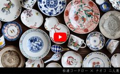
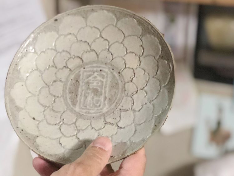
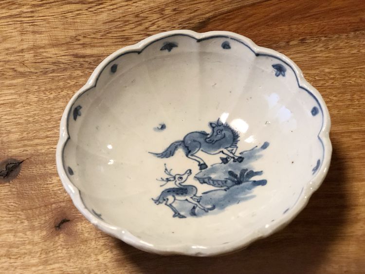
Hanada: The motif on this plate, inspired by Tenshō karuta (a predecessor of playing cards), really stands out.
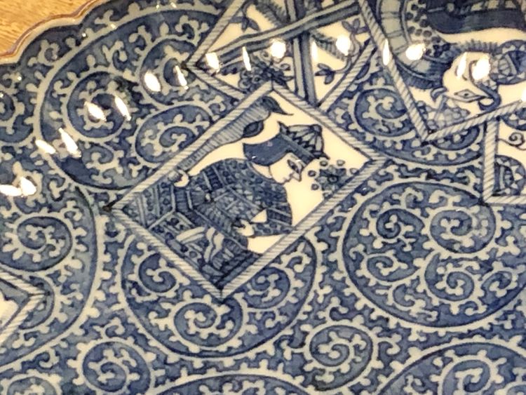
Kotaro Matsuura: I made this around my second year working as a painter at a kiln, after graduating from a training school in Kyoto (this piece is not included in the current exhibition).
I designed the motif myself.
At the time, I was very conscious of demonstrating my skills—using subtle shading to enhance the whiteness, or carefully filling in details—to earn recognition by giving it everything I had. But now, the kind of work I admire most is what Mansaku Nakao does.
There’s a saying, “Great skill appears clumsy,” and I feel that perfectly captures the essence of what I’m drawn to now.
Blue-and-White Loved by the Japanese
Hanada: When one thinks of your work, overglaze enamels often come to mind first, but your sometsuke (blue-and-white) pieces are also very compelling.
Kotaro Matsuura: Japanese people really do love sometsuke, don’t they? Whether it’s early Imari, ko-sometsuke, or gosude, I think Japanese people are drawn to sometsuke because they can sense the smell of the clay.
Hanada: There was even a book titled “The Scent of Gosu.”
Kotaro Matsuura: In the past, one major theme was how to achieve a clean, vivid gosu blue on a pure white, thin porcelain body—but historically speaking, that has already been accomplished.
Rather than that, I find myself drawn to porcelain like that of Mansaku Nakao or Shingo Oka.
I want to paint on a body rich with character, so that the gosu feels alive—almost as if its presence were rising from the surface.
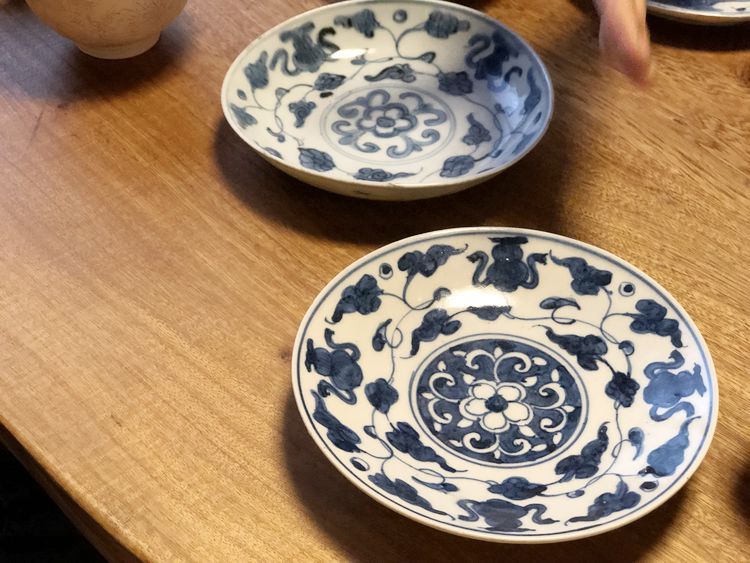
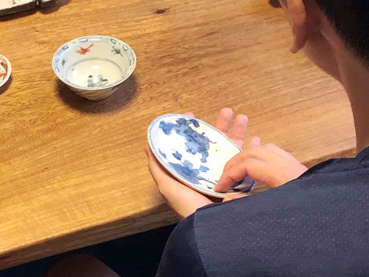
Sometsuke Oval Plate with Floral Motif
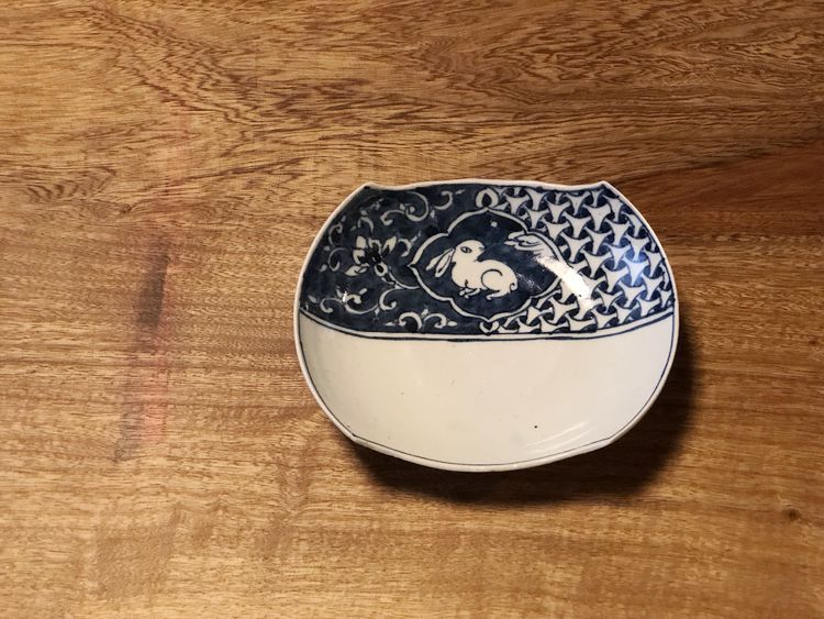
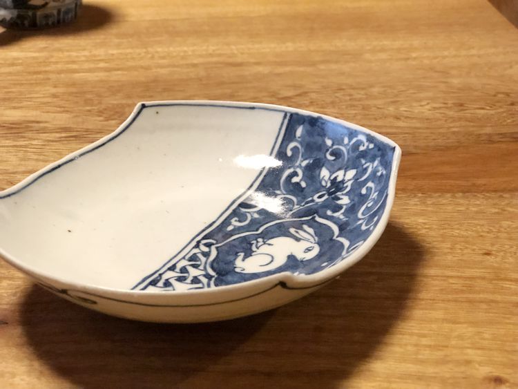
Hanada: This oval plate with a peony design feels quite different from your earlier works, even in the quality of the clay.
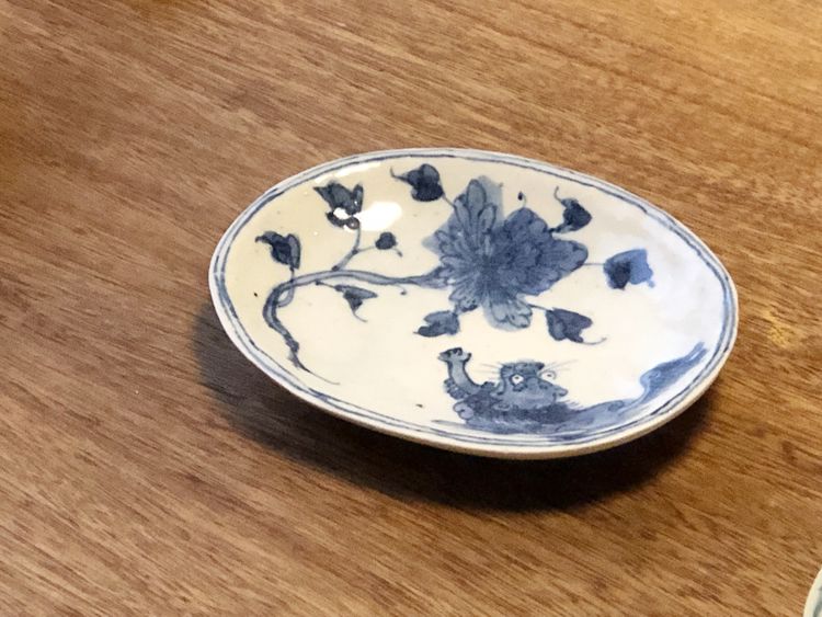
Kotaro Matsuura: I really like how it feels to the touch as well.
It’s made using an outer mold technique found in ko-sometsuke; because pressure is applied from the inside, the well develops an interesting expression (this method involves shaping the vessel with a plaster mold applied to the outside rather than the inside).
Even among ko-sometsuke, there are thicker pieces, aren’t there? That sense of form is what I had in mind.
Hanada: The tone of the gosu, the expression of the lion—it feels partly like ko-sometsuke… and partly like old Kutani…
Kotaro Matsuura: I think that’s because all of those influences are mixed together in my head as I work toward my own ideal vision of sometsuke.
There are so many historical examples, but deciding what exactly is appealing about each is something you have to interpret for yourself.
I love old works, so I enjoy reproducing them faithfully—but lately, I can’t help wanting to change things, even just a little (laughs).
With both Mansaku Nakao and Shingo Oka, you can sense many influences, yet the work is unmistakably their own.
Hanada: Were there any particular considerations in the composition?
Kotaro Matsuura: The proportions between the motifs aren’t true to life, are they? The lion-and-peony motif is common, but here the lion is brave yet smaller than the peony. I hope it comes across as slightly humorous.
Working with the Hand as It Moves
Hanada: The density in the floral areas is clearly different from your earlier, more strictly trained work.
Kotaro Matsuura: Absolutely. Some of the gosu spills over, and uneven patches are left in the solidly painted sections.
In an essay titled “Learning from Ko-sometsuke” published in an Imari journal, Shunzo Masaki discusses the difference between “trained hands” and “hands that follow their own movement.” I found the phrase “hands that follow” especially illuminating.
He describes ko-sometsuke lines as clumsy but drawn with great effort. comparing them to the calligraphy of Ryōkan—and only someone who has actually traced those brush movements could offer such a precise explanation. I don’t think there’s a clearer articulation of the essence of ko-sometsuke than that.
It’s writing that could only come from someone with truly deep insight.

Hanada: Shunzo Masaki’s work clearly rests on an enormous foundation of knowledge, yet he continues to express it through everyday tableware.
Kotaro Matsuura: “If a trace of the hand remains in the movement—where the brush enters and where it leaves—that is beautiful. Even where unevenness remains, that too is beautiful.” That’s how I interpret Shunzo Masaki’s words.
In the past, I would have tried to erase any unevenness in pigment or glaze marks.
Hanada: His work feels like a refined, elevated realization of exactly that idea—achieved with complete naturalness.
Kotaro Matsuura: The way Masaki connects his lines is extraordinary.
It’s not something you can do easily at all.
Ceramics I Truly Love
Kotaro Matsuura: By the way, I tried making this sake cup in the style of early Imari.
Early Imari itself ranges from opaque to quite translucent, after all.
Hanada: When you grow fond of something, you simply have to try making it yourself.
You can really feel your love for ceramics.
Clay from the Ancient Lake Biwa Stratum
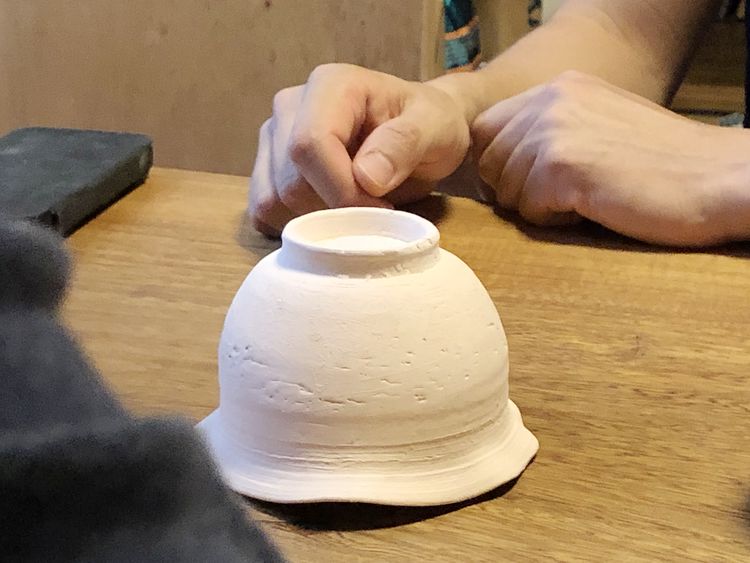
Hanada: I’ve heard that you’re introducing changes to both your porcelain and earthenware this time.
Kotaro Matsuura: With porcelain, I’m aiming for something more rustic, and recently I’ve begun adding raw Shigaraki clay.
Lake Biwa is said to have shifted from around present-day Shigaraki and Iga to its current location, and the strata in those areas are called the Ancient Lake Biwa layer.
So essentially, I’m using clay from what was once the lakebed.
For example, this piece is still bisque-fired, but it uses relatively coarse clay.
I threw it while it was quite soft, then trimmed it gently with a not-too-sharp tool while it was still pliable.
Hanada: And how about your earthenware?
Kotaro Matsuura: When you look at Bizen ware, of course firing quality matters, but the work of true masters is always refined. Their wheel work is completely different. Without glaze, that difference becomes even more apparent.
That’s why I admire Michihiro Domoto—his work is so well composed.
He trained in Bizen, so his tokkuri(Japanese sake flasks) and closed forms are exceptionally skillful.
That’s why I currently have a theme in mind: “boldness in porcelain, refinement in earthenware.”
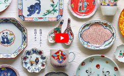
A Slightly Mean Sparrow
Hanada: These are overglaze plates with sparrow motifs.
Kotaro Matsuura: I took inspiration from old Imari overglaze ware.
Many Imari overglaze pieces are densely painted, but I liked the atmosphere of this sparrow design, so I bought a full set of five.
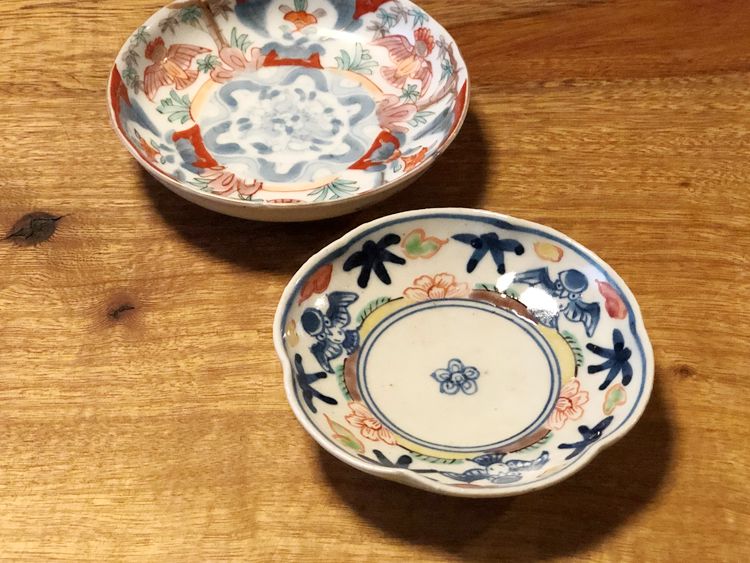
Hanada: You’ve given the sparrow a bit of an attitude—almost mischievous.
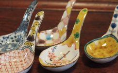
Brush-Washer–Shaped Mukōzuke
Hanada: This brush-washer–shaped mukōzuke has a wonderful cut to it.
Kotaro Matsuura: This one was difficult.
I threw it on the wheel, altered it into a square, and then cut it.
With porcelain, you’d normally use a mold for this shape, but I chose a more earthenware-like approach—altering and refining it by hand after throwing.
Hanada: Just as you said—“boldness in porcelain, refinement in earthenware.”
Exploring Celadon
Hanada: You also work with celadon.
Kotaro Matsuura: I also make several types of celadon.
For this one, I applied a glaze similar to ash-glaze celadon over porcelain clay with a high iron content. The decoration uses the paper-stencil technique seen in Imari celadon.
With iron-rich porcelain clay, the white slip patterns come out very clearly. (※This piece is not included in the exhibition)
Hanada: This celadon has a different feel again.
Kotaro Matsuura: I’m aiming for the look of Hisui celadon.
I was influenced by early Northern Song Yue ware and Goryeo celadon.
From there, it takes on the green of Yaozhou ware, a color I really like from that period. It has a wood-ash glaze feel. But it’s not too subdued—it has a restrained brilliance, a quiet elegance combined with subtle liveliness.
For the Exhibition
Hanada: We’re looking forward to your exhibition.
Kotaro Matsuura: I plan to focus mainly on colored and sometsuke pieces, so please look forward to it.
≪ END ≫
意識の変化
花田:こちらのうつわは天正カルタ(トランプの祖型)の文様が印象的です。(以下花田-)
松浦(コータロー):京都の訓練校を出た後、窯元に絵付師として勤務して二年目くらいに作ったものです(今回の出品はありません)。
図案は自分で考えました。
白さを引き立てるために少しだけ薄濃(うすだみ)をしたり、しっかりと書き込んだり、当時は自分の技術を出し切って認めてもらうことを意識していた気がしますが、今憧れるのは万作さんのような仕事です。
「大巧は拙なるがごとし」という言葉がありますが、まさにその通りだと思います。
日本人が好きな染付
-:松浦さんというと、色絵がまず頭に浮かびますが、染付も魅力的です。
松浦(コータロー):日本人は染付好きですよね。
初期伊万里しかり、古染付しかり、呉須手しかり、やっぱりあの土の匂いなんだと思います。
-:「呉須のにおい」という本もありましたが。
松浦(コータロー):昔はいかに純白な薄手の素地に呉須を綺麗に発色させることがテーマの一つでしたが、それは歴史的には既に達成されたわけです。
僕はそうではなくて、万作さんや岡晋吾さんみたいな磁器に憧れます。
味わいのある素地に、それこそ呉須が匂ってくるような絵付けをしたいなと思います。
染付楕円文楕円皿
-:この染付牡丹文楕円皿は、素地の雰囲気も従来の松浦さんのものとは違います。
松浦(コータロー):触った感じも気に入っています。
古染付のやりかたで、外型を使っているのですが、内側から押しあてるので見込みに面白い表情が出ます(※石膏型をうつわの内側ではなく、外側にあてるように成形することを外型と呼びます)。
古染付でも厚手のものがあるじゃないですか。
あの造形感覚です。
-:呉須の色調、獅子の表情等々、古染付っぽいところも…古九谷っぽいところも…。
松浦(コータロー):頭の中で色々ミックスされた上で、自分の理想の染付像を目指しているのでそう見えるのだと思います。
昔のものにも色々ありますが、それぞれの何がいいのかっていうのは、自分で解釈するしかないと思います。
僕は古いものも大好きだから、そっくり再現する仕事も好きですけど、最近は少しでも変えないと気が済まないです(笑)。
万作さんも岡さんも、色々なエキスは感じるけど、ご自分の仕事になっていますものね。
-:構図などで気を使われたことはありますか。
松浦(コータロー):これ、実際の大きさ関係とは違いますよね。
唐獅子牡丹は良くあるテーマですが「獅子が勇ましいけど牡丹より小さい」という。
ちょっとコミカルに見てもらえたらいいなと思います。
手なりの仕事
-:花の部分の濃なんか、松浦さんの職人時代の濃とは明らかに違うと思います。
松浦(コータロー):もちろん。
はみ出したり、ムラが残ったりしています。
伊万里の雑誌の「古染付に教えられて」という論考の中で正木春蔵さんが「手慣れ」と「手なり」の仕事の話をされているのですが、特に「手なり」という表現に教えられるものがありました。
古染付について、たどたどしい下手の一生懸命の線と評して良寛の書に例えられているんですが、筆跡を真似てなぞった者にしか解らない、実作者ならではの的を得た解説で、これ以上端的に古染付の本質について論じたものはないと思います。
本当に見識が深くなければ、著せない文章だと思います。
-:正木さんのお仕事は、膨大な裏打ちがあってこそですね。
それを飽くまで食器という分野で実践し続けています。
松浦(コータロー):「『(筆が)ここから入って、ここから抜く』という動きの中で手跡が残ったとしたら、それは美しい。ムラが残ったところで、それは美しい」。
僕は正木さんの言葉をそういう風にも解釈しています。
昔の僕だったら、絵の具のムラや釉薬の手跡も消してしまっていたでしょうね。
-:正木さんの仕事はまさにそれが洗練された高いレベルで、さらに自然な形で実現されていると感じます。
松浦(コータロー):正木さん、線の継ぎ方なんて、凄くうまいじゃないですか。
あれって、そう簡単にはできることではありません。
大好きな焼き物
松浦(コータロー):ところで、このぐい呑みは初期伊万里っぽく作ってみました。
初期伊万里も不透明なものから透明感のあるものまで、色々ありますけど。
-:松浦さんは、何かを好きになると、自分で作らないではいられないのですね。
焼き物への愛情を感じます。
古琵琶湖層の土
-:今回は、磁器も土ものも、つくりに変化を加えていると伺いました。
松浦(コータロー):磁器については、野趣のあるものを目指していて最近信楽の原土を加えることもあります。
琵琶湖って今の信楽や伊賀あたりから今の位置に動いてきたらしくて、現在の信楽や伊賀あたりの地層は古琵琶湖層と呼ばれています。
昔、琵琶湖底だった場所の粘土を使っていることになりますね。
例えば、これはまだ素焼きですが、比較的荒い土を使っています。
柔らかめの状態でロクロを引いて、あまり鋭くないカンナで柔らかいうちに削っています。
-:つちものはいかがですか。
松浦(コータロー):備前なんかを見ていると、もちろん焼きの良し悪しもありますが、名手の方々の仕事を見ると、やはり端正なんです。
轆轤が全然違う。
無釉だから、なおさら…。僕が土本訓寛さんを好きなのも、やはり端正だからです。
土本さんも備前で修業していたから、徳利なんかのふくろものも、凄くうまいですよね。
そういうわけで「磁器は豪快に、つちものは端正に」というテーマを今持っています。
いじわるスズメ
-:色絵スズメ文のお皿です。
松浦(コータロー):古伊万里の色絵を参考にしました。
伊万里の色絵って細かく描き込まれたのが多いのですが、これはスズメが描かれていて好きな雰囲気だったので、5客揃えで買いました。
-:スズメもアレンジして、いじわるそうに。
筆洗型向付
-:この筆洗型向付は切り方もいいですね。
松浦(コータロー):これ、難しかったです。
ロクロを引いて、四角く変形、それから切っています。
磁器だと型を作って成形しそうな形状ですが、「ロクロのあと変形させて細工」という土ものっぽい成形の仕方をしました。
-:さきほど伺った「磁器は豪快に、土物は端正に」ですね。
青磁も色々と
-:松浦さんは青磁も作られます。
松浦(コータロー):青磁も何種類かやっているのですが、これは鉄分の多い磁土に、灰の多い灰釉青磁みたいなものを掛けています。
装飾は伊万里青磁にある、紙型摺りです。
鉄分のある磁土だと、白化粧の模様が鮮明に出てきてくれます。(※今回の出品はありません)
-:この青磁はまた雰囲気が違います。
松浦(コータロー):翡色青磁のイメージです。
越州窯の北宋初期くらいのものや高麗青磁に影響を受けました。
で、耀州窯のグリーンになってきますが、こういう時代の色味が好きです。
灰釉っぽいイメージで。
でも地味すぎず、派手さもありつつ、落ち着いた華やかさというか…そんな感じです。
展示会に向けて
-:展示会、よろしくお願いします。
松浦(コータロー):色絵と染付中心で作ろうと思いますのでよろしくお願いします。
≫松浦コータローさんのうつわはこちらから≪
関連記事はこちら