


English version of the interview here.
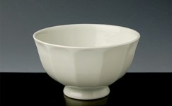
Graceful, from the Nara period.
Hanada: I’d like to ask about your new works.
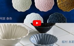
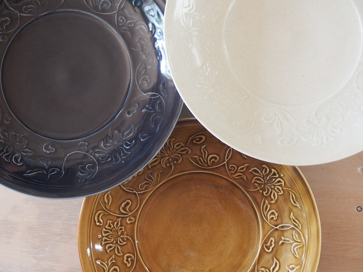
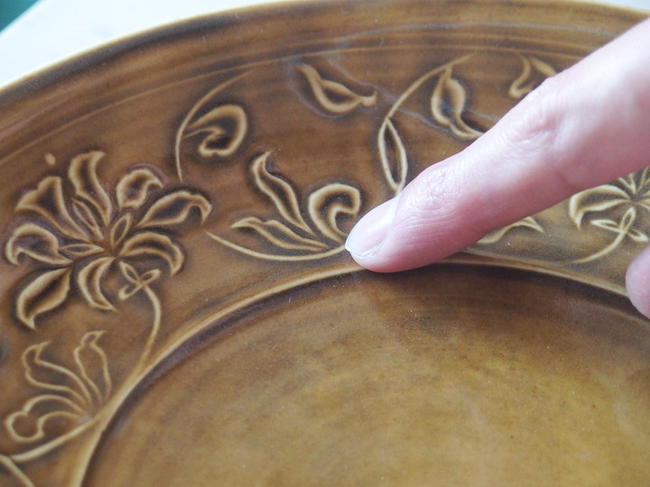
First, the 7.5-inch plate with the raised Hōsōge pattern.Why did you choose the Hōsōge motif?
Haruya Abe: I wanted to create something glamorous.
The Hōsōge pattern is a Buddhist decorative motif that was popular in Japan during the Nara period.
It’s wonderful that something popular in the Nara period still feels appealing today.
I think it fits within the flow of the work I’ve done so far.
Hanada: What do you mean by “the flow of your work so far”?
Haruya Abe: I mean plant-based motifs like arabesques and flowers; I feel familiar with them both technically and aesthetically.
Hanada: Why have you used so many plant motifs?
Haruya Abe: They are elegant without being too assertive, and I think they pair well with food.
Hanada: Aside from their elegance, what is the charm of the Hōsōge pattern as a motif?
Haruya Abe: Although it comes from Buddhist design, it also works well on plates for Western food like pasta.It fits today’s mixed Japanese food culture as well.
Hanada: The first impression of this plate doesn’t feel purely Eastern.
Haruya Abe: This pattern originally came from vases. With vases, you can’t view the whole design at once.
When composing such designs, you consider the depth of hidden parts, but with a plate you must consider the overall layout without escape.
I carefully cut each part of the vase pattern and arabesque, but arranged them on the plate so the balance would not feel off.
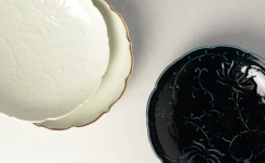
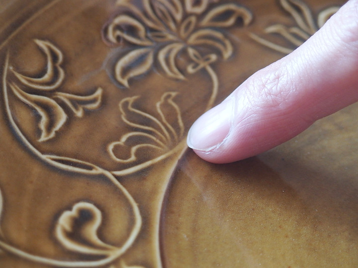
Hanada: The glaze accumulation on the yellow plate is beautiful.
Was that accidental or intentional?
Haruya Abe: Well… yes… I did it on purpose (laughs).
It was calculated.
Having done this many times, I can roughly predict how the glaze will settle when carved this way…
Ah, I forgot to carve this part on the plaster mold.
Haruya Abe: This is a sample, so from next time it will be carved properly.
But comparing them like this, the three-dimensional effect is different.
Hanada: It has become a one-of-a-kind piece (laughs).
The .5 Habit
Hanada: Did you pay attention to the width of this band?
Haruya Abe: I considered the width for easy plating.
In that sense, it’s slightly larger than 7 inches, at 7.5 inches.
It allows for some openness when serving food, making it a nice plating size.
7.5 inches may seem awkward, but I find it practical.
8 inches is quite large, 7 inches feels insufficient—at least in my household.
Hanada: Now that you mention it, you often use “.5” sizes (laughs).
Haruya Abe: You noticed (laughs)?
Hanada: Yes, just now (laughs).
Haruya Abe: It started when my family mentioned it about three years ago…
5.5 inches, 3.5 inches… I have a habit of using these “.5” sizes (laughs).
Salt Soba and Ko-Imari
Hanada: Next, the scalloped-edge plate.
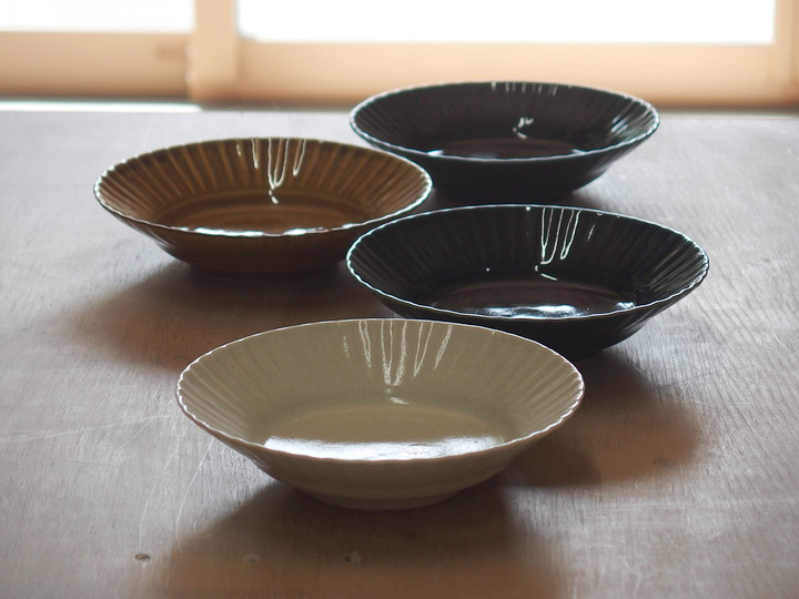
Haruya Abe: I made this because I wanted a small plate for oden.
Once at a soba restaurant, I had salt soba—soba with rock salt, lemon, and olive oil—served on a slightly smaller Ko-Imari plate, which inspired me.
It stayed in my mind, and I decided to try it this time.
It’s good for small dishes with a bit of liquid, like oden, and the shape makes plating easy.
Hanada: It would also work for sashimi.
Haruya Abe: The center is flat, so it’s easy to plate.
Continuing the “.5” theme, it’s 5.5 inches.
Hanada: A “.5” man, huh (laughs). You really like the “.5” story today.
Haruya Abe: (laughs)At 5 inches it feels cramped.
Slightly larger gives more room when serving and makes eating feel more relaxed.
About the Scalloped-Edge Plate
Hanada: Did you pay attention to anything when making the Scalloped-Edge Plate?
Haruya Abe: The Ko-Imari example had a rough feel. Before, I tried to make perfectly neat edges, but I thought this natural look was nice.I aimed for a natural feel this time.
Hanada: “Aiming for a natural feel” must be more difficult. The spacing of the waves is all different.
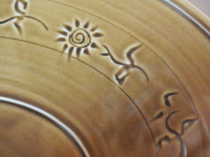
Haruya Abe: Each one is different, but overall it looks like a flower.
Hanada: This part rises slightly and then flares outward.
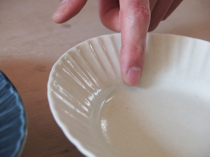
Haruya Abe: It allows liquids to settle nicely and the rough edge gives a sense of shape.
I adjusted the lines to prevent elongation and balance the overall form.
Functionally, it also makes it easier to scoop with a spoon.
Hanada: The wavy edge appears differently depending on the color.
Haruya Abe: Of course it’s a matter of preference, but I think this shape suits Ruri (deep blue) best.
Hanada: I wouldn’t want the individual parts to be too distinct.
Haruya Abe: This plate is meant to show the overall atmosphere.
It’s better if nothing stands out too much.The same goes when plating food.
Haruya Abe: Yes, initially it was meant as an oden plate, but it also works for stuffed cabbage, pot-au-feu, and both Japanese and Western dishes.
Plate with Cat Motif
Hanada: Next, the cat. This is the first time animals appear in your works.
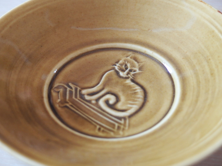
Haruya Abe: It’s my first time outside of chopstick rests.
I’ve been working along an extended line, so I wanted to try something a little different.
Hanada: Why did you choose a cat?
Haruya Abe: Because I like cats.I used to have a cat named Tom, but not anymore. Tom has always been on my mind.
Hanada: He was a member of your family, after all.
Haruya Abe: I made a slightly grumpy-looking cat. In my view, it’s “a little ugly but cute.”Tom was like that.
For the exhibition
Hanada: Thank you very much.
I’d like to ask for your previous works as well, so I look forward to the two-person exhibition.
Haruya Abe: Likewise, thank you very much.
≪ END ≫
華やかに。奈良時代から。
花田:今回の新作について、お話を伺います。
まず陽刻宝相華文7.5寸皿。
なぜ宝相華文を選んだのですか。(以下花田-)
阿部:華やかなものを作りたかったからです。
宝相華文は、仏教装飾の文様で、日本では奈良時代に流行っていたそうです。
奈良時代に流行ったものを今でも普通に良いなと思えるなんて良いですよね。
今までの仕事の流れの中にある文様だと思います。
-:今までの流れ、というのはどういうことですか。
阿部: 唐草や花などの植物系の文様のことで、感覚的にも技術的にも慣れている気がします。
-:植物が多かったのはなぜですか。
阿部: 華やかさもありながら、主張し過ぎないし、食べ物との相性も良いと思います。
-:宝相華文の文様としての魅力は「華やかさ」以外にありますか。
阿部: 仏教からきている模様ではありますが、お皿にするとパスタなどの洋食にも合うんです。
今の日本の混ざり合っている食文化にも合いますよね。
-:このお皿の第一印象も、そんなに東洋の雰囲気一辺倒でもありませんね。
阿部: これは元々壷の文様でした。
壷などの立ちものはどうやったって、文様を一望はできませんよね。
そういうものの構成は見えない部分の奥行を考えながら組み立てていくのですが、逆にお皿は逃げ場なく全体の構図を考えなければなりません。
壷の文様の花の咲き方や、唐草のめぐらせ方などパーツパーツは忠実に切り取って、文様の配置はお皿の上でバランスが悪くならないように構成しました。
-:黄磁は特に釉のたまり方がきれいですね。
偶然ですか。それとも、想定どおり?
阿部:これは・・・、はい・・・、敢えてやりました(笑)。
計算です。
何度もやってきたようなことではあるので、こうやって彫ったらこう釉がたまってこう見えるだろうなというのは大体想像付くので・・・。
そうそう、ここだけ、石膏型で彫り忘れたんです。
阿部:これは見本ですので、次回からちゃんと彫られています。
でも、こうやって比べて見ると、立体感が違います。
-:幻の一点となりましたね(笑)。
刻む癖
-:この帯の太さは何か気にしましたか。
阿部: 盛り付けやすいように太さを考えました。
盛りやすさという意味では、7寸よりちょっと大きい7.5寸。
盛り付けたときにある程度余白も出来て、キレイに盛り付けられるサイズにしようと思いました。
7.5寸って、中途半端な感じかもしれませんが、僕は使いやすいと思うんです。
8寸は結構大きいし7寸だと物足りない。
少なくとも我が家では。
-:言われてみると、阿部さん「.5」多いですね(笑)。
阿部: 気付きました(笑)?
-:ええ、たった今(笑)。
阿部: 3年くらい前に家族に言われたのがきっかけで・・・。
5.5寸とか3.5寸とか・・・僕刻むんです。
刻む癖がある(笑)。
塩蕎麦と古伊万里
-:次は輪花です。
阿部:これは、おでんの取り皿が欲しくて作りました。
ある時、お蕎麦屋さんで、塩蕎麦が―蕎麦を岩塩、レモン、オリーブで食べるんです―これのもう少し小さい古伊万里で出てきて、それがヒントになっています。
ずっと頭に残っていて今回やってみました。
おでんみたいな、ちょっとした汁のものにもいいし。
盛り付けやすい形だなと。
-:お造りにもよさそうです。
阿部: 見込みはフラットにしてあるので、盛りやすいと思います。
これも、さっきの話の続きなんですけど5.5寸なんです。
-:「.5」の男ですね(笑)。
「.5」の話、したがりますね、今日は。
阿部: (笑)。
5寸だと、窮屈というか。
一回り大きいと、盛り付けたときにゆとりが出て、食べる時も気分がゆったりする気がします
輪花について
-:輪花を作るときに気にしたことありますか。
阿部: その古伊万里の輪花はラフな感じだったんです。
それまでは、キレイに仕上げようと思ってキツイ輪花になっていたのですが、こういう輪花も良いなって。
今まで輪花を作る時は美しく作りたかったのですが、今回は自然な感じを心がけました。
-:「心がけて自然な感じ」というのは却って難しいでしょうね。
輪花の間隔、全部違います。
阿部: 一個一個はバラバラだけど、全体としては花になっているようにしました。
-:この部分、少し立ち上がってから外側に開いていますね。
阿部:汁物を入れた時や食べ終わった後にも底にきれいにたまりますし、輪花がラフだからこその、ここの絞まり―かたちのメリハリをつけようと思いました。
間延びしそうな部分を、そこでラインを一度整えて、全体のバランスを取っています。
機能としても、スプーンで、すくいやすいです。
-:色によって輪花の出方が違いますね。
阿部: もちろん好みだとは思いますが、こういう形はルリが一番合うと思います。
-:パーツパーツがハッキリしすぎちゃうのは嫌ですね。
阿部: 全体の雰囲気を見せたいお皿なので。
出過ぎないようなもののほうが良いのかなと思います。
料理を盛った時も勿論そうなんだと思います。
阿部: そうそう、最初はおでん皿のつもりで作りましたが、ロールキャベツやポトフにもいいし、和にも洋にもいけますよ(笑)。
猫のお皿
-:次は猫。
初めてうつわに動物が登場しますね。
阿部:箸置き以外では初めてです。
しばらく延長線上での仕事を進めていたので、少し違うことにもチャレンジしたいなと思いました。
-:なぜ、猫を選んだのですか。
阿部: 猫が好きなので。
トムという猫を昔飼っていましたが、今はいません。
常にトムのことは頭にあったので。
-:家族の一員ですものね。
阿部: ちょっと性格の悪そうなブスな猫を作ってみました。
僕の中では「少しブスだけど、可愛いな」という猫です。
トムがそうでした。
企画展に向けて
-:有難うございました。
今までのものもお願いしたいと思っていますので、二人展よろしくお願いします。
阿部: よろしくお願いします。
≫阿部春弥さんのうつわはこちらから≪
関連記事はこちら