


English version of the interview here.
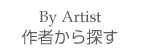
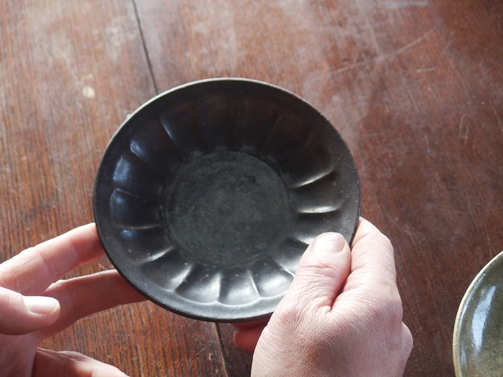
Mishima Chrysanthemum Square Bowl
Hanada:
I’d like to ask you about the pieces you are exhibiting this time.
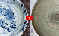
First, this is Mr. Shimura’s Mishima Chrysanthemum Square Bowl, a new work we also used for the DM.
Mutsuhiko Shimura: Yes. I wanted to make something square.
Hanada: What pattern did you use in the center?
Mutsuhiko Shimura: In the center, there are chrysanthemums and ruyi heads. The surrounding area is completely filled with chrysanthemums.
I had seen this kind of composition on round Mishima plates before, so I adapted it to a square form.
Hanada: Mishima patterns are perceived as a whole rather than in parts, so they don’t distract from the food.
Mutsuhiko Shimura: Since the design isn’t assertive, it really makes the food stand out.
It feels like it comes together when you plate something, more than just as a standalone piece.
Hanada: Because it’s fully covered, it can actually serve as a subtle background. Maiko, what do you think?
Maiko Miyaoka: The shape is solid and strong, but the floral pattern softens it nicely. At first, there was also a rope-pattern sample, right?
Mutsuhiko Shimura: That’s right. But I preferred the floral one, so we chose this.
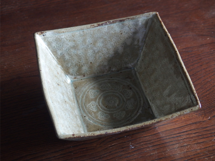
The Charm of Light and Shade
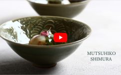
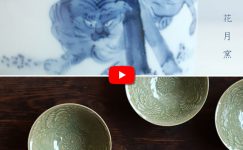
Hanada: Next is this celadon piece. Is it originally Korean celadon?
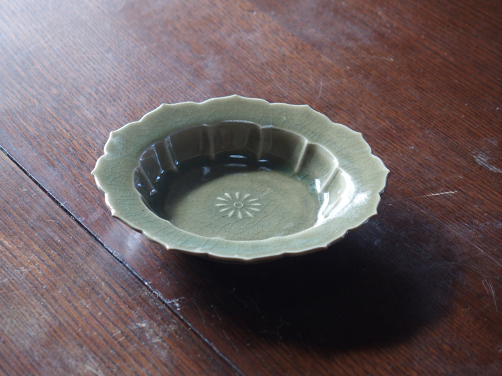
Mutsuhiko Shimura: Yes. The shape partially exists in the past, but it’s a combination of multiple pieces I’ve seen before. I thought I’d make “something a little cute”… well, is this cute… (laughs)
Maiko Miyaoka: You wanted to make something cute? (laughs)
Mutsuhiko Shimura: Not exactly cute, more like a little floral…
Hanada: You reconsidered while talking (laughs). For a small plate, it’s quite sturdy.
Mutsuhiko Shimura: Yes. Even though it’s Korean celadon, it’s more influenced by Chinese techniques, maybe around Yaozhou kilns…
Hanada: How did you approach shaping it?
Mutsuhiko Shimura: Celadon has a beautiful glassy quality when it pools, so I made sure the edges stand well to allow pooling.
Maiko Miyaoka: The variations in shade really come out.
Hanada: What would you use this for?
Maiko Miyaoka: Japanese sweets, for example…
A Dish Without Words
Hanada: Next, let’s look at this black piece.
Mutsuhiko Shimura: That was a poor choice (laughs). It’s too simple; I can’t really comment on it.
Hanada: “A dish without words” also has its appeal, doesn’t it?
Mutsuhiko Shimura: I think it really makes the food pop, especially colorful dishes with reds and greens.
Hanada: Recently, more black pieces have been appearing.
Mutsuhiko Shimura: I’ve wanted to do this for a while.
Hanada: This dry texture feels nice.
Mutsuhiko Shimura: I made two types; the other has a glossy finish. In both cases, I wanted to evoke a metallic feel.
Hanada: How would you use it?
Mutsuhiko Shimura: As a small serving plate, or for Japanese sweets—it would look nice.
Maiko Miyaoka: Again, for Japanese sweets (laughs).
Mutsuhiko Shimura: It is mostly Japanese sweets, isn’t it?
Hanada: It’s very Shimura-san style and fun (laughs).
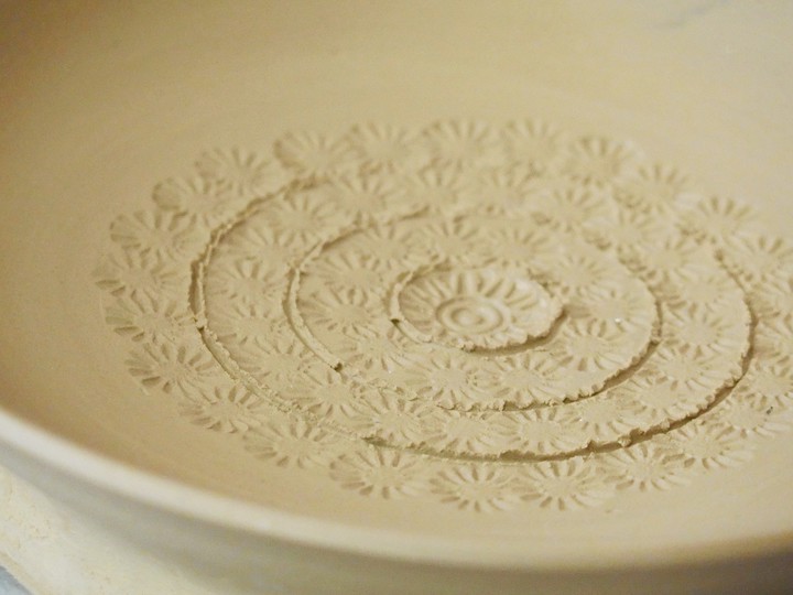
Brushes and Carving Tools
Hanada: Next, this piece you showed during production.
Mutsuhiko Shimura: I surrounded a large flower with smaller ones.
Hanada: Maiko, how do you feel about this new work?
Maiko Miyaoka: It feels fresh to me. It’s something you haven’t done before, right?
Mutsuhiko Shimura: The woven pattern is new.
Hanada: It’s neat and clean. The pattern has both subtle and distinct areas, which works well.
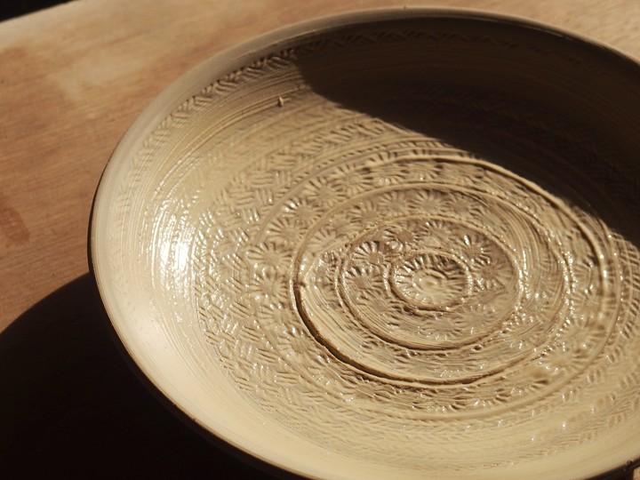
Mutsuhiko Shimura: This time I used a brush, but I also sometimes carve with a kanna. It changes the overall feel.
With a brush, it feels cohesive; with a kanna, some parts stand out more, creating stronger contrasts.
Hanada: How do you decide which technique to use?
Mutsuhiko Shimura: If the pattern is unclear and the piece would look boring, I use a brush to bring out the whole image. With this woven pattern, carving only part of it wouldn’t reveal what it was, so I wanted the full design to appear.
Battle of Red Cliffs
Hanada: Next, Maiko, please. This is interesting.
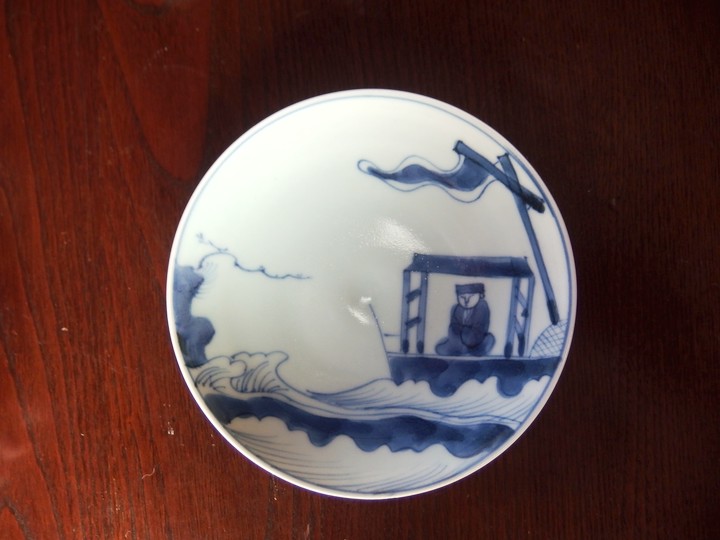
Maiko Miyaoka: This is Ko-sometsuke. I copied an old Imari piece that itself copied Ko-sometsuke.
Mutsuhiko Shimura: Battle of Red Cliffs? Is this Zhuge Liang?
Maiko Miyaoka: No, the other one.
Hanada: Zhou Yu?
Maiko Miyaoka: Not Zhou Yu, it’s Cao Cao. Sun Quan and the others are on the sea side. You can check to confirm. There was also a version with two figures, but we didn’t make it this time.
Hanada: It’s the same motif, but with various versions, right?
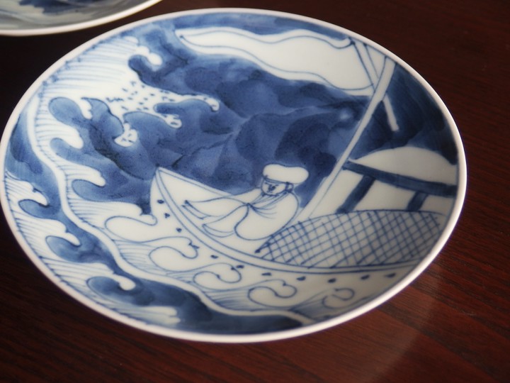
Maiko Miyaoka: I’m thinking of exhibiting one of them. Which do you prefer?
Hanada: I like both, and having two plates seems more fun. Since the theme is the same, they pair well together. Perhaps people prefer this one. It feels more like your style, Maiko.
Mutsuhiko Shimura: The figure feels like your usual style, Maiko.
Maiko Miyaoka: This playful style (laughs)?
Hanada: A very attractive pattern.
Maiko Miyaoka: I like the theme, and although it’s a battle scene, the illustration feels relaxed. Even the depiction of waves contributes to a well-composed scene.
Hanada: How was it to paint?
Maiko Miyaoka: The plate is this size, but I painted the sea as if it extended beyond the edges.
This type of plate works well for that.
Hanada: The painting really conveys a sense of wind.
Maiko Miyaoka: I avoided exaggerating the waves or movement because it would look unnatural (laughs).
Hanada: “Moderation,” right?
Maiko Miyaoka: Yes. Just a normal sense of balance.
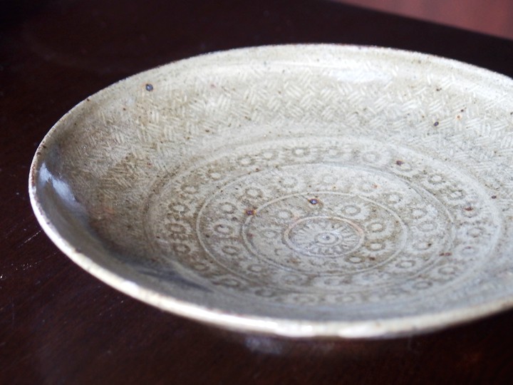
From Hexagon to Octagon
Hanada:
Next is the indigo-painted octagonal bowl with a bird motif, also used in the DM.
Both the shape and painting reflect Maiko’s style.
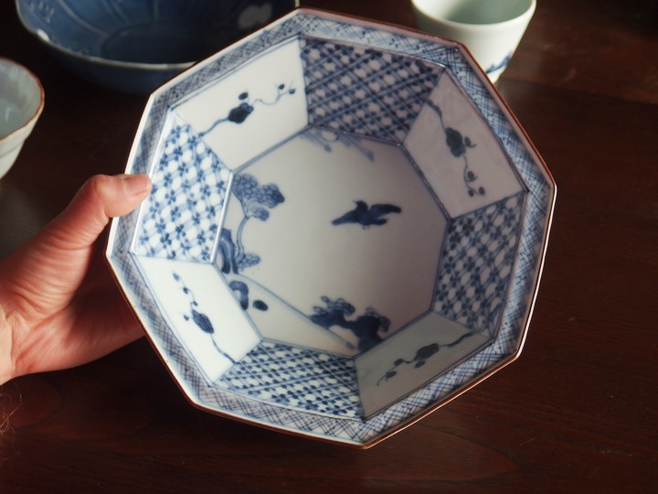
Maiko Miyaoka: I wanted to make a slightly shallower octagonal bowl than usual. The idea came from a small hexagonal Aikutani plate with a painted motif in the center. I adjusted the edge patterns to match the shape and avoided filling the entire surface with painting. Considering the season, I scattered some plum blossoms like this.
Hanada: It seems to go well with various dishes.
Mutsuhiko Shimura: Simmered vegetables, or for this season, simmered bamboo shoots with Tosa-style seasoning.
Unglazed Areas
Hanada: Next, this piece.
Maiko Miyaoka: I guess you could say it has white unglazed areas.
Hanada: Maiko, you also do the Suisaka technique, right?
Mutsuhiko Shimura: Suisaka involves carving a previously applied glaze with a kanna, but this one wasn’t glazed in the first place, so it feels softer.
Maiko Miyaoka: It has a fluffy feeling.
Mutsuhiko Shimura: Carved Suisaka pieces are more linear. I like those too, though.
Hanada: This is 6.5 sun. The size and shape seem very practical.
Maiko Miyaoka: It’s the usual size for side dishes.
Mutsuhiko Shimura: Also good for simmered fish.
Maiko Miyaoka: Simmered fish? That’s unexpected.
Mutsuhiko Shimura: Unexpected?
Hanada: It would work for chunky dishes like yellowtail with daikon.
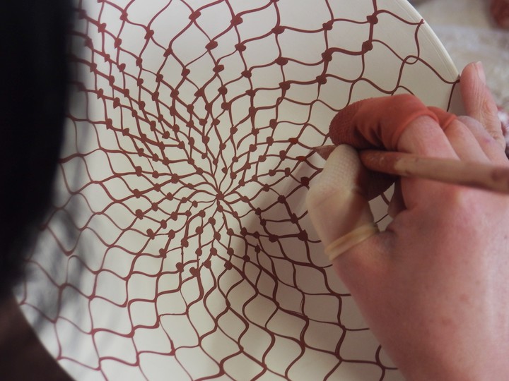
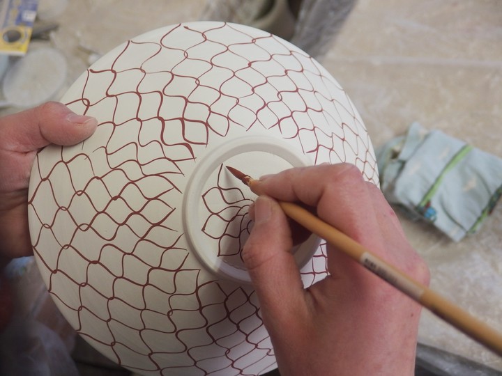
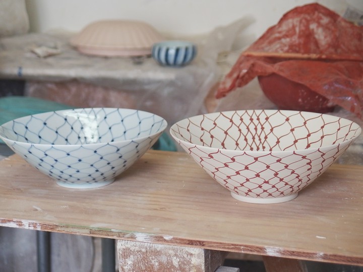
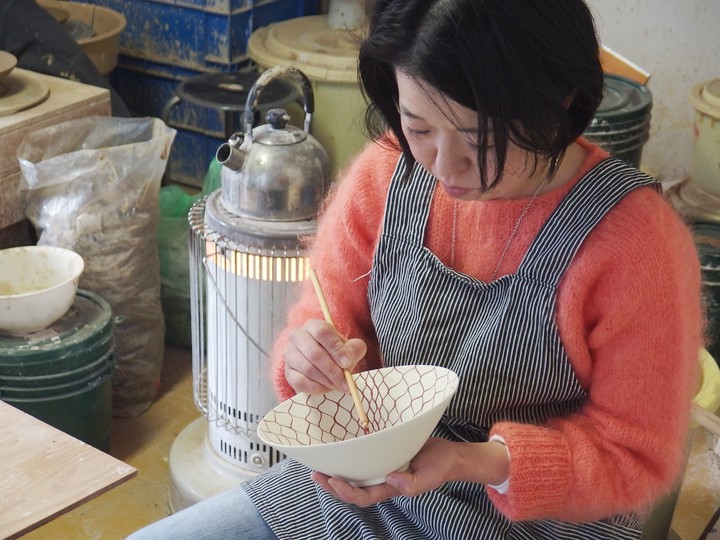
The Story of Net Pattern
Hanada:
Next is the net pattern. We saw you painting it, and your brush moved smoothly with a “shasha-shasha” motion.
Even while painting, it seemed very satisfying.
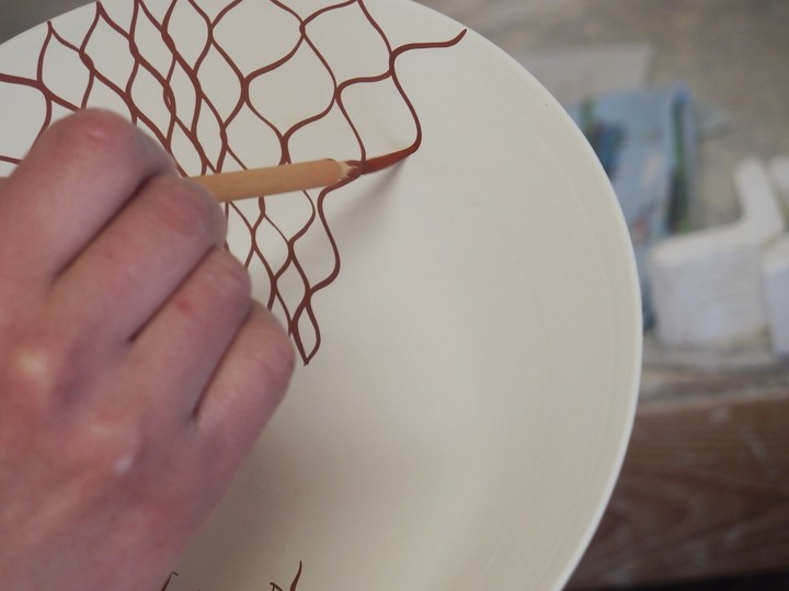
Maiko Miyaoka: The first stroke is always a bit tense. After several strokes, when I reach the middle, I start feeling freer. I also adjust the pattern tension while painting…
Hanada: There are various net patterns: some vertical, some horizontal, some with intersecting lines, or connected with dots. You use the vertical type. Did you try others before settling on this?
Maiko Miyaoka: This feels the most natural for my hand movements.
Hanada: What do you keep in mind while painting?
Maiko Miyaoka: I try not to get stiff. In other words, I don’t aim to paint perfectly or neatly. Often, the best results come when I finish and realize, “Oh, it turned into this pattern.”
Hanada: Do you ever find that the pattern doesn’t quite match up at the end (laughs)?
Maiko Miyaoka: Yes. But somehow it works out in the end. Even I don’t know why (laughs).
Hanada: Do you ever paint different types of net patterns?
Maiko Miyaoka: Double-layered patterns are interesting too, using two brushes at once, like the rice bowls Masako Shirasu had.
Hanada: Didn’t you try that too?
Maiko Miyaoka: I did, but not recently.
Hanada: What is the appeal of continuous patterns for you?
Maiko Miyaoka: Continuous patterns feel like exercise. I don’t exercise at all lately, so this is a little workout (laughs).
Hanada: It’s just your hands, isn’t it (laughs)?
Maiko Miyaoka: Jokes aside, I enjoy the rhythm and tempo of continuous patterns.
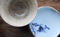
Front and Back of the Dish
Hanada: Shall we look at this one?
Mutsuhiko Shimura: This was arranged based on a soba cup borrowed from Hanada, right?
Maiko Miyaoka: The painting is the same, but the shape is changed. I wanted to make a small pouring cup. It’s cute, isn’t it?
Hanada: The contrast between the front and back patterns is nice.
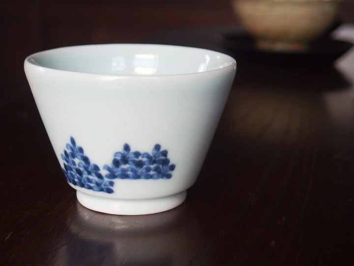
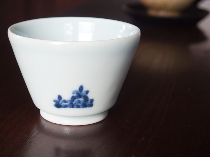
Maiko Miyaoka: Since I changed the clay this time, it turned out nicely.
For the Exhibition
Hanada: Please say a few words about the exhibition.
Mutsuhiko Shimura: Last time, we showed white porcelain serving plates, but this time we are making Mishima serving plates.
Maiko Miyaoka: Ah, so they become Mishima…
Hanada: Maiko, you’ve already seen them, right?
Maiko Miyaoka: I saw them and thought, “They’re making some serving plates.” Just a quick glance (laughs).
Mutsuhiko Shimura: You were looking…
Maiko Miyaoka: Mishima is nice. Maybe I’ll make a serving plate too.
Mutsuhiko Shimura: This time, we’re also making flat jars, either Mishima or black Korean celadon.
Hanada: How about you, Maiko?
Maiko Miyaoka: I want to focus on copying early Imari blue-and-white patterns. Overall, it feels like “toward spring.”
Hanada: Thank you very much. We look forward to the exhibition.
≪ END ≫
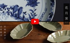
三島菊文角鉢
花田:
今回の展示会に出品いただくうつわについてお話を伺いたいと思います。
まずは、この志村さんの三島菊文角鉢です。DMにも使わせていただいた新作です。(以下花田-)
志村: はい。四角いものが作りたかったので。
-: 見込みの文様は何ですか。
志村: 見込みは菊と、如意頭です。まわりは全面を菊にしました。
三島の丸いお皿でこういう構成を見たことがあったので、それを四角にしました。
-: 三島の文様は、パーツパーツではなく全体として目に入ってくるので、料理の邪魔はしません。
志村: 主張が少ないので、料理映えはしますね。
うつわ単体よりも、盛り付けて成立する感じです。
-: 埋め尽くしているから、却って背景になりうるというか。宮岡さんからみて、いかがでしょうか。
宮岡: かたちは、しっかりしていて強い感じですが、模様はお花でやわらかいところがいいな、と思います。最初は、縄目の見本もあったよね。
志村: そうだったね。花のほうがよかったので、こっちを選びました。
濃淡の魅力
-: 次はこの青磁です。元々高麗青磁ですか。
志村: そうですね。かたちは部分的にはありますが、過去に見た複数のものの組み合わせです。「ちょっと可愛いものを」と思って…いや、これ可愛いか…(笑)。
宮岡: 可愛いものを作りたかったの(笑)?
志村: 可愛いというか、ちょっとお花の…。
-: 話しながら考え直しちゃいましたね(笑)。小皿にしてはつくりがしっかりしています。
志村: そうですね。まあ、高麗とはいえ、中国の影響が強いほうでしょうか、耀州窯あたりの…。
-: かたち作りはいかがでしたか。
志村: 青磁のガラス質が溜まるときれいなので、溜まるようにふちをしっかり立たせています。
宮岡: 濃淡が出るね。
-: これは何に使いましょうか。
宮岡: 和菓子とか…
語ることがないうつわ
-: 次はこの黒、いきましょうか。
志村: 選択ミスだ(笑)。シンプルすぎて、何もコメントできないな。
-: 「語ることがないうつわ」というのもいいですね。
志村: 料理映えはすると思います。赤とか緑とか、色がカラフルなものなど特に。
-: 最近、黒が増えました。
志村: 前からやりたかったので。
-: この、カサカサとした感じ、いいですね。
志村: 二種類作っていて、もうひとつは光沢があります。
いずれにしても金属っぽい感じを出したかったので。
-: 何に使いましょうか。
志村: ちょっとした取り皿でも。和菓子もきれいだと思います。
宮岡: これまた和菓子(笑)。
志村: 和菓子ばっかりですね。
-: 志村さんたちらしくて、楽しいです(笑)
刷毛とカンナ
-: で、制作を見せていただいたこのうつわ。
志村: 大きい花を小さい花で囲みました。
-: 宮岡さん、この新作いかがですか。
宮岡: 私には新鮮に感じます。今までやっていないよね。
志村: 網代は初めて。
-: スッキリしていいですね。文様もおぼろげなところとハッキリ見えるところが出ていて、いいですね。
志村: 今回は刷毛を使いましたが、カンナで削り出すこともあります。雰囲気は大きく変わります。
刷毛だと、全体的にまとまりのある感じですが、カンナだと、出たり、出なかったりするので表情の濃淡が強く出ます。
-: どういう風に使い分けるのですか。
志村: 文様がよく分からないとつまらないものは、刷毛で全体像を出そうとします。この網代なんかは、部分的に削っても何の模様か分からないので、全部出したかったということです。
赤壁の戦い
-: 続いて、宮岡さんお願いします。これ、面白いですね。
宮岡: これは古染付です。古染付を写した古伊万里を写しました。
志村: 赤壁の戦い?これ、孔明かな。
宮岡: いや、もう1人のほう。
-: 周瑜ですか。
宮岡: 周瑜じゃなくて、曹操のほう。孫権たちは海側じゃないから。調べれば分かると思います。
二人乗っているバージョンもありました。今回は作っていませんが。
-: これも同じモチーフ。色々とバージョンがあるんですね。
宮岡: どちらか今度の展示会に出そうかと思っています。どちらがいいですか。
-:
両方好きですし、二枚あったほうが楽しい気がします。絵のテーマも一緒だから、合わせて使いやすいし。
こっちのほうが皆好きなのかなあ。というか、こっちのほうが宮岡さんぽいです。
志村: 人の感じがいつもの宮岡っぽいですね。
宮岡: このとぼけた感じ(笑)?
-: 魅力的な文様ですね。
宮岡: テーマも好きですし、戦いなのに絵柄がのん気っぽいところや、波の表現なんかも含めて、場面の構成がとてもいいなと思います。
-: 描いていて、いかがでしたか。
宮岡: このお皿はこの大きさなのですが、海がお皿の外まで広がっているような感覚で描きました。
特にこれは、そういうタイプのお皿だと思うので。
-: 風も感じる絵付けです。
宮岡: 波をクルッとしたりして、動きを見せようとし過ぎてもわざとらしいので、そういうのはやめておきました(笑)。
-: 「ほどほどに」ですね。
宮岡: はい。普通の感覚で。
六角から八角へ
-:
次は、DMにも使った染付鳥文八角鉢です。
かたちも絵付けも宮岡さんらしいうつわになりました。
宮岡: いつも作っている八角鉢より少し浅めのものを作ろうと思いました。アイデアの元は、この見込みの絵付のある藍九谷の小皿で、六角です。縁の柄などはかたちに合わせて変えました。あまり全部絵で埋めないように構成して、季節もあるし、こうやって梅を散らして。
-: 色々な料理に合いそうですね。
志村: お煮しめとか、これからの季節は、タケノコの土佐煮とか。
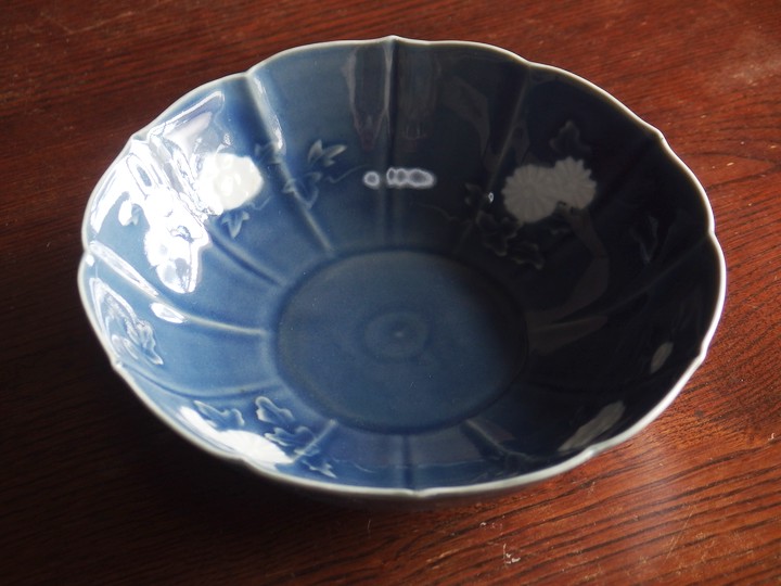
釉抜きのうつわ
-: 続いて、こちら。
宮岡: なんていうのかな、白抜きしてます。
-: 宮岡さんは吸坂手なんかもされます。
志村: 吸い坂は一度掛けた釉をカンナで削るけど、これは元々かけていないから、柔らかい感じがするね。
宮岡: フワッとした感じだね。
志村: 吸坂手なんかの削ったものは、直線的というか。それも好きですけど。
-: これは6.5寸。使い勝手の良さそうな大きさ形ですね。
宮岡: いつものおかず用です。
志村: 煮魚とかもいいし。
宮岡: 煮魚、意外だね。
志村: 意外?
-: ぶり大根とかゴロゴロしているのだったらいけそうです。
網手のハナシ
-:
続いて網手です。描いているところを見せていただきましたが、シャッシャッシャッと、なめらかな感じで筆が進んでいきます。
描いていても、気持ち良さそうな雰囲気がありました。
宮岡: 毎回、ひと筆目は多少緊張します。そして、何本か描いていって、真ん中あたりになると気持ちが自由になってきます。網自体も途中で絞ったり緩めたり…。
-: 網手にも色々あります。縦に描かれていたり、横だったり。網目どうしが引っかかっていたり、玉でつながっていたり。宮岡さんは縦ですね。色々描いてみて、これに落ち着いたのですか。
宮岡: これが、手が一番自然に動くんです。
-: 描くとき、大事にしていることはありますか。
宮岡: 固くならないように。言い換えると、上手く描こうとか、きれいにしようとしない、ということです。描き終わって気がついたら、こんな網になっていた、という時のほうが良い感じに落ち着いている気がします。
-: 最後に辻褄が合わなくなってしまうことなどありませんか(笑)。
宮岡: あります。でも、結局はなんだか合っちゃうんです。自分でも分からないんですよ(笑)。
-: ところで、違う感じの網手は描かないのですか。
宮岡: 二重のものも面白いですよね。筆を二本持って描いていく。白洲正子さんが持っていたご飯茶碗みたいな。
-: あれ、宮岡さんもやっていませんでしたか。
宮岡: やっていましたけど、最近やっていないです。
-: さて、宮岡さんにとって連続文様の魅力はなにでしょうか。
宮岡: 連続文様は運動みたいな感じです。最近、運動を全然しないので、これくらいの運動はしておかないと(笑)。
-: 手先だけじゃないですか(笑)。
宮岡: 冗談はさておき、連続文様はリズムやテンポを楽しんでします。
うつわのオモテとウラ
-: これ、いきますか。
志村: これ、花田さんに借りたそば猪口をアレンジしたんだよね?
宮岡: 絵付けは一緒だけど、形を変えました。汲み出しを作りたくて。可愛いですよね。
-: 表と裏の文様の感じがいいですよね。
宮岡: 今回は土を変えたから良い感じになったなあって思っています。
展示会に向けて
-: 展示会に向けて一言お願いします。
志村: 前回、白磁の台皿を出しましたが、今回は三島の台皿を作っています。
宮岡: あ、あれ、三島になるんだね…。
-: 宮岡さん、これはもう見ているんですね。
宮岡: 「なんか台皿を作っているな」と思って見ていました。チラ見ですけど(笑)。
志村: 見ていたんだ…。
宮岡: 三島、いいね。私も台皿作ろうかな。
志村: 扁壺も今回は作っています。三島か黒高麗で。
-: 宮岡さんはいかがでしょうか。
宮岡: 初期伊万里の染付の模しを中心に作りたいなと思っています。全体的には「春に向けて」の感じで。
-: 有難うございました。展示会、宜しくお願いします。
関連記事はこちら